
Multifamily
Brand Identity Design
ALL PHOTOGRAPHY & DESIGN MATERIALS © BARTELSANDJAMES.DESIGN 2025
For nearly three years, I worked full-time, in-house for a national multifamily real estate asset management group with a portfolio worth billions. Due to the extensive nature of their holdings, they wish to remain anonymous, but I would be happy to discuss my tenure in full.
In my role, I served as the organization’s internal and external creative agency. I reported to the Marketing, Corporate Communications, and Executive Leadership Teams, led a six-person internal Brand Team, Art Directed external design studios, and managed the occasional intern.
Except when directing outside studios, I executed my graphic and brand identity design individually, as the organization’s lone creative. My work impacted billions of dollars of physical assets, and I personally branded communities cumulatively worth over $800,000,000
11
Researched, ideated, designed, pitched, and oversaw on-site execution of 11 distinct properties’ brand identity designs across the country. These totaled many hundreds of millions in assets and accounted for thousands of units.
49+
Brand identity projects I Creative Directed, both within my organization and in collaboration with third party studios.
ADDING VALUE
The stated objective of this organization is to add value to real estate. I contributed to that aim through brand identity design work — I researched, ideated, and proposed brand names, logotypes, logomarks, color palettes, brand fonts, iconography, illustrations, patterns, signage, and web design configurations.
Upon reaching consensus amongst key stakeholders, I advised, directed, or executed the application of each brand onsite. This in-house process saved time and money, and, in my admittedly biased opinion, produced more thoughtful, articulate, and engaging work than our industry competitors at a fraction of the price.
Pictured: Brand showcase for West Village, a sprawling multifamily campus on the site of a refurbished tobacco plant in Durham, NC.
Operating in this manner afforded me near-complete creative freedom. Still, the branding process was meticulous, accounting for dozens of tasks. Depending on the project, it could involve over 75 stakeholders across all teams, functional groups, and levels of seniority.
BRANDING CASE STUDY
THE GUILD NORTH HOLLYWOOD
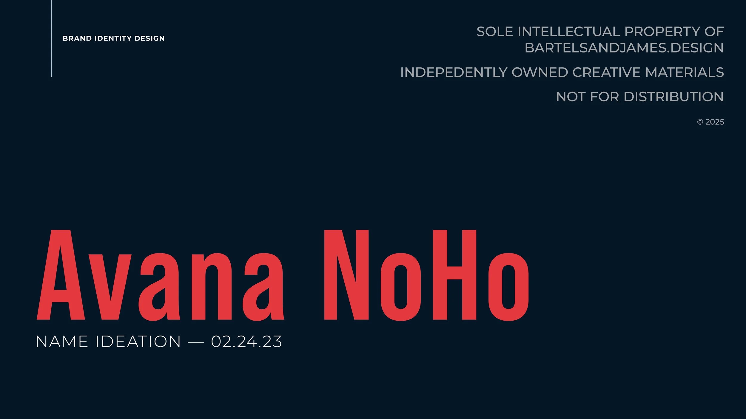
Problem: This apartment community retained the generic corporate identity of its original developer, “Avana.” When our firm purchased it, we had less than a month to produce a new name and visual identity that would not just avert a trademark suit, but would accurately, vibrantly, and enticingly reflect this Hollywood-adjacent property and its residents: influencers; industry creatives; and young professionals.

Pictured: With such a vast portfolio, our process often started with a deep dive on Google Streetview, local forums, and outreach to in-market colleagues. This download of each community and its regional flavor offered a basic understanding of potential solutions.
As always and above all, quality research would bear the fruit of a compelling and meaningful design solution.
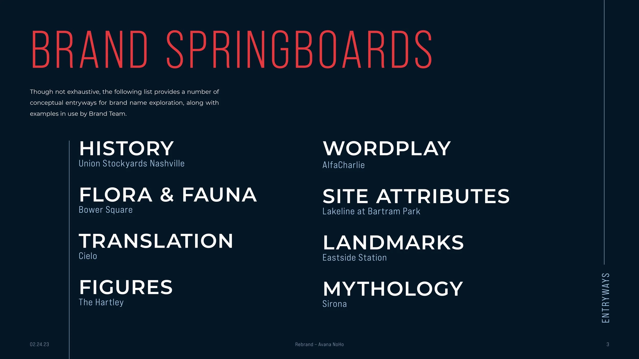
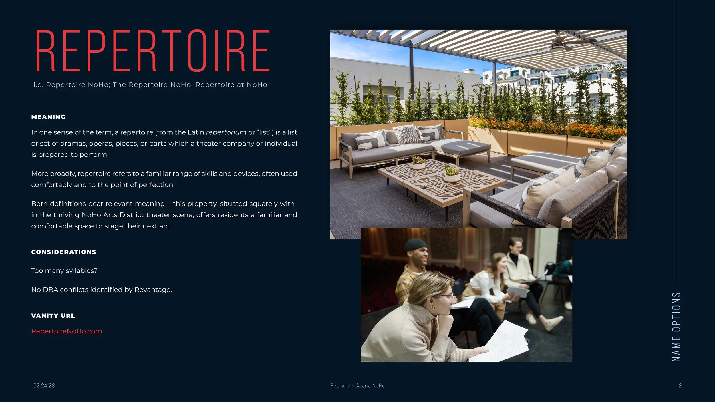
After intense research into the NoHo neighborhood, community, region, and its past, present, and future, I engaged in dialogues, mind mapping, brainstorming, forced connections, and other creative stimulation techniques. I then proposed six name options to our key stakeholders, as seen in the following deck.


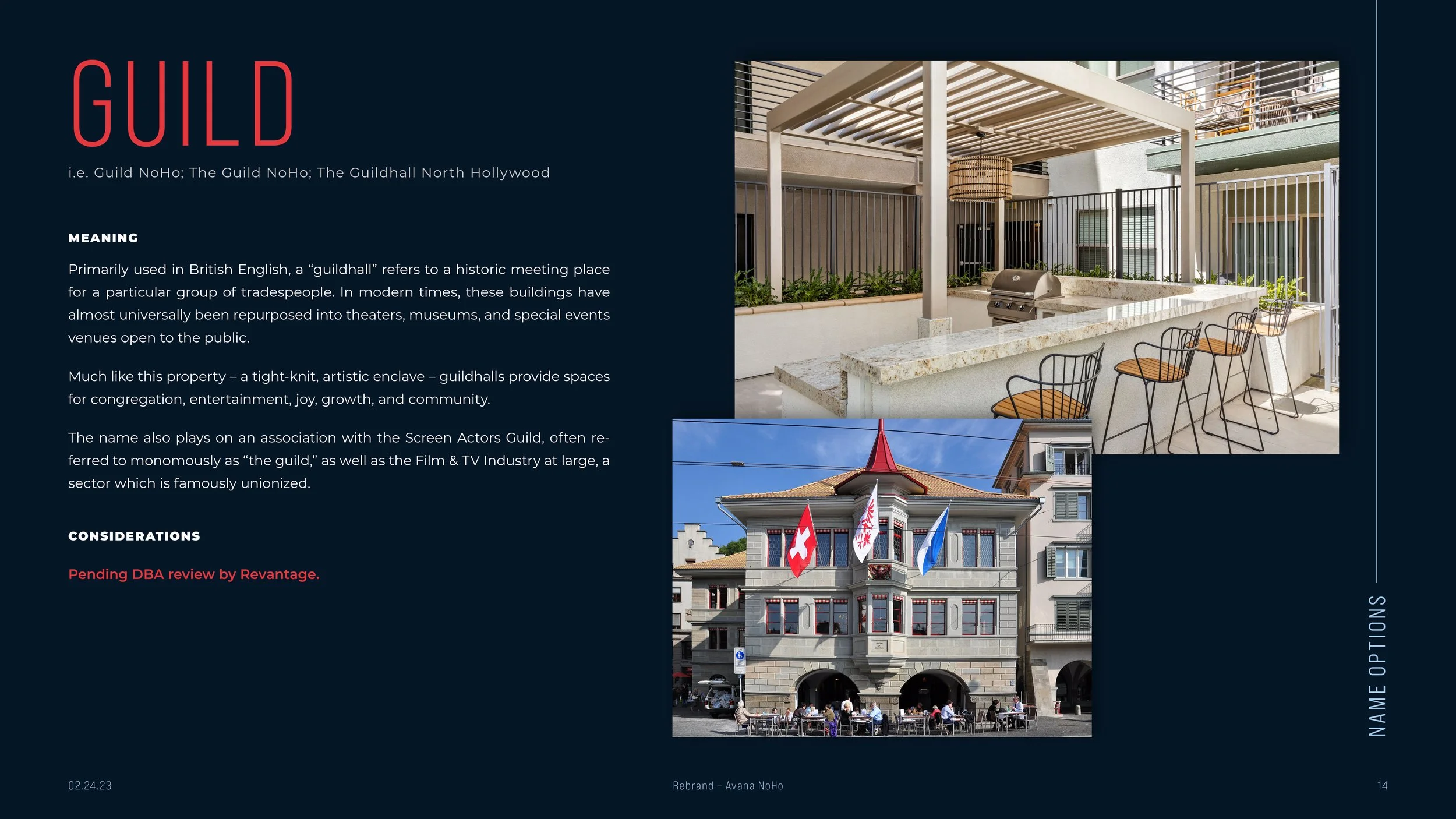


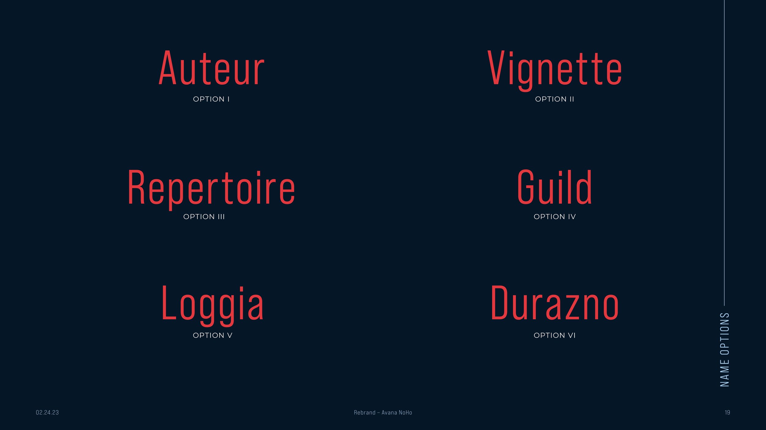

Following some healthy debate, we settled on the winner:
The Guild North Hollywood
I thereby built out the following visual identity directions in accordance with the conceptual directions detailed in the above deck.
Visual Identity Directions
01. Give ‘em Their Flowers
02. Golden Age Swash
03. Diamond Reel
Brand Snapshot
Pulling Focus

Brand Application
ALL PHOTOGRAPHY & DESIGN MATERIALS © BARTELSANDJAMES.DESIGN 2025